LOVE. SWEAT. FITNESS
A digital fitness community that offers fitness classes, workout and meal programs via their mobile app and e-commerce store.
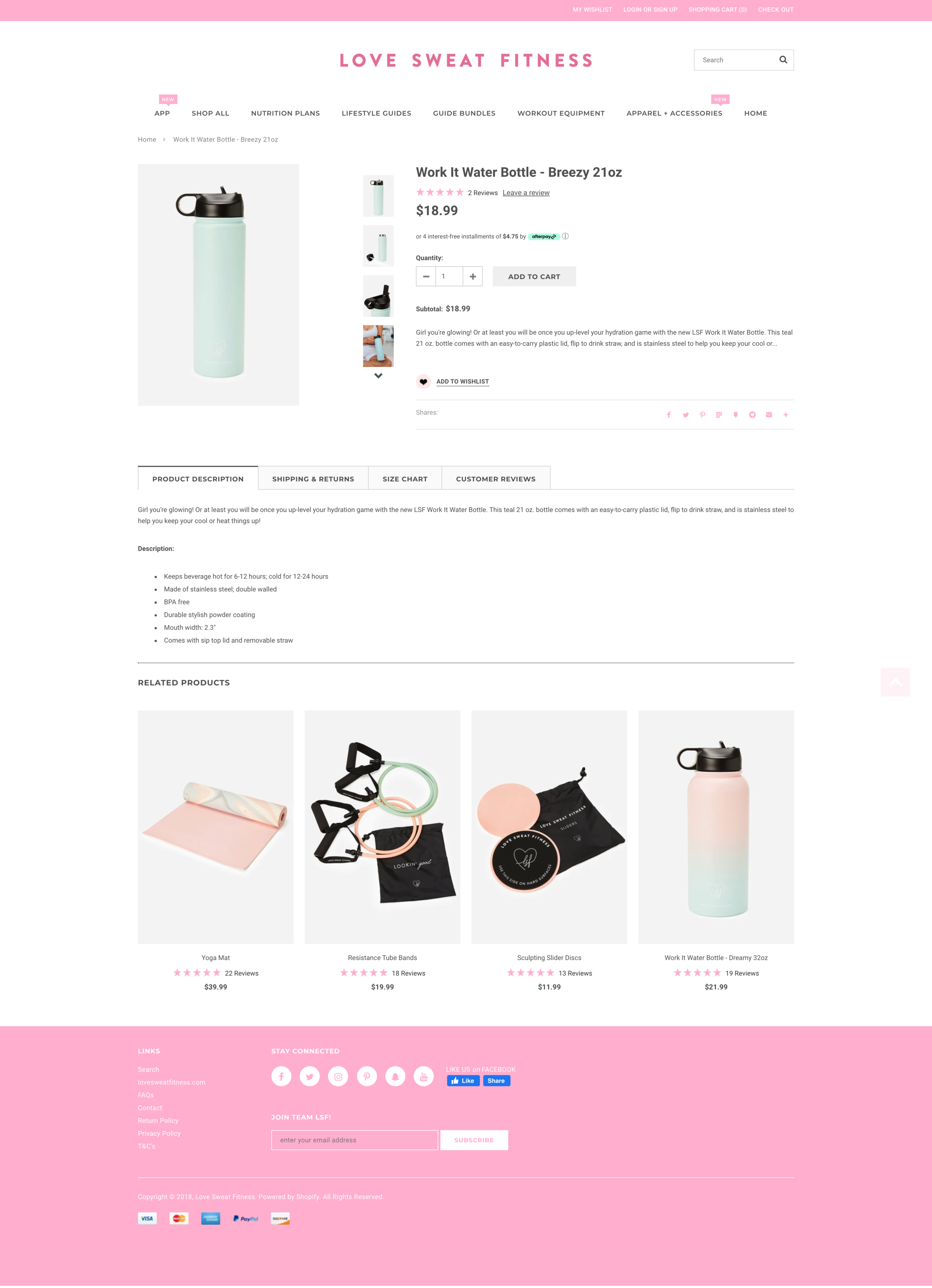
I was tasked with overhauling their e-commerce store design. I decided to do a modern take to elevate their youthful branding and help them appeal to a slightly broader demographic while still maintaining their core brand style.
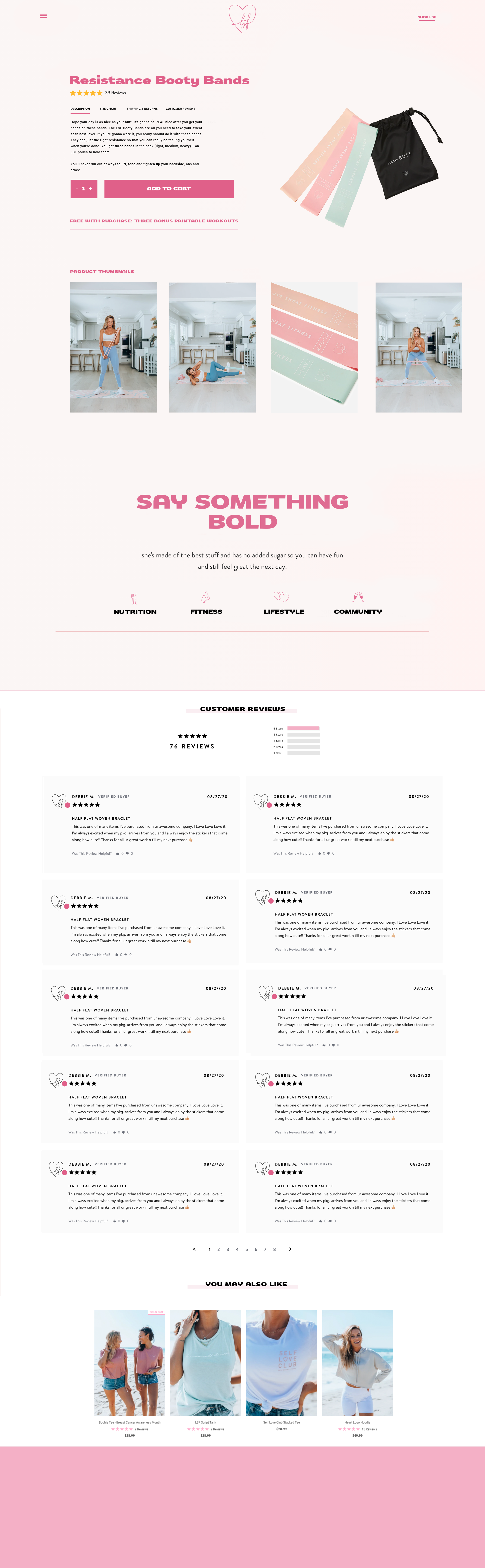
After
Before
Design Decisions:
I felt that the original design lacked personality and felt like a stock template so I used their brand guide to play with typography and color to create something fresh and modern.
I chose bolder fonts for the titles and CTAs to draw the user’s attention.
I removed the thumbnail background square to create a clean image that focused on the product without distraction from the background.
I showcased the additional thumbnails below so the user doesn't have to click and can see additional product views at first glance.
I did a secondary title to provide a deeper dive into why this product is beneficial to the user. I added vector imagery above to hold the interest of the user visually as well as create a visual way to understand what the below descriptor text is trying to convey.
I added a more visual customer review experience. With these easy-to-read reviews, the user can felt connected to past customers and easily read reviews to further convince them that they need the product.
Lastly, I added a “You May Also Like” title to shop related products. I felt the original related product title was very small, dull, and didn’t make the user excited to click and view additional items. By creating a bold and more personal header/CTA combo you are more likely to grab the attention of the audience and have them complete the action.